RunnerShine
GameShelf
Marquee
Film
Graphic Design
GameShelf
Overview
Business Problem: Social spaces online dedicated to gaming are cumbersome to use, decentralized, and intimidating to new gaming enthusiasts.
Task: Design a desktop interface for a social platform centered around various game titles and gaming communities.
Competitive Analysis
Steam
Discord
Reddit
Nintendo Miiverse
Steam provides a wealth of data on each title and a community page, but posts are difficult to interact with and have no prioritization
Discord is useful for small groups as most servers are invite-only
Reddit is helpful share tips to get through tough parts of games or work through bugs
Nintendo Miiverse struggled to moderate a social gaming platform aimed towards younger audiences
Site Map & User Journey
Determined the basic pages necessary to cover all facets of solving the business problem
Included subcategories including links to store pages to purchase the game you're browsing or posting about
"Favorites" seemed like too vague of a category, so the game library had to be organized differently as shown in the next section
Mapped out a basic User Journey below the Site Map focusing on how a user would create a post
Designed to create as few steps to the "Create" button as possible
Initial Sketches
Sketched my initial design to resemble a shelf holding game discs
Similar interface to the old way you'd scroll through album covers on 3rd-generation iPods
Included detailed view for each game and a general newsfeed
Sketched a second design closer to Discord and Steam
Designed a profile page with a tabbed view to access details
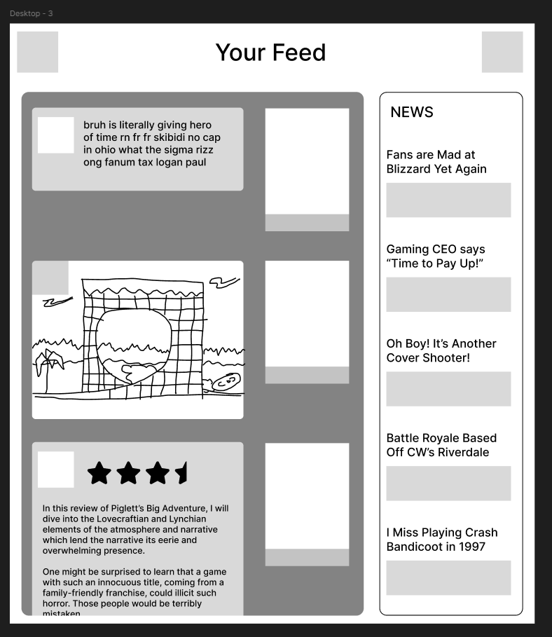
Low-Fidelity Wireframe
Drafted low-fidelity wireframes of the initial shelf-based sketch concept
Rounded the corners of the detail windows to invite clicking and provide a welcoming feel against the dark palette
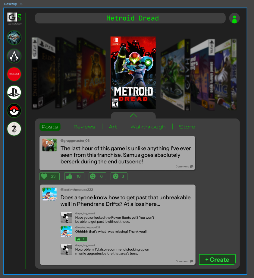
High-Fidelity WireFrame
Experimented with various fonts to find a suitable logo
I found myself inspired by the font "Libre Barcode 39" and decided to incorporate it into the logo, using the negative space for the
G
High-fidelity wireframe with game box art included
Utilized the "Perspective Toolkit" plugin to emulate the original iPod album scroll
Included spine box art, which many other gaming sites do not archive
Chose a color palette in dark grays and bright greens to evoke the appearance of old DOS displays, such as those seen in Fallout 3
Included sidebar icons akin to Discord to cover franchises with multiple entries
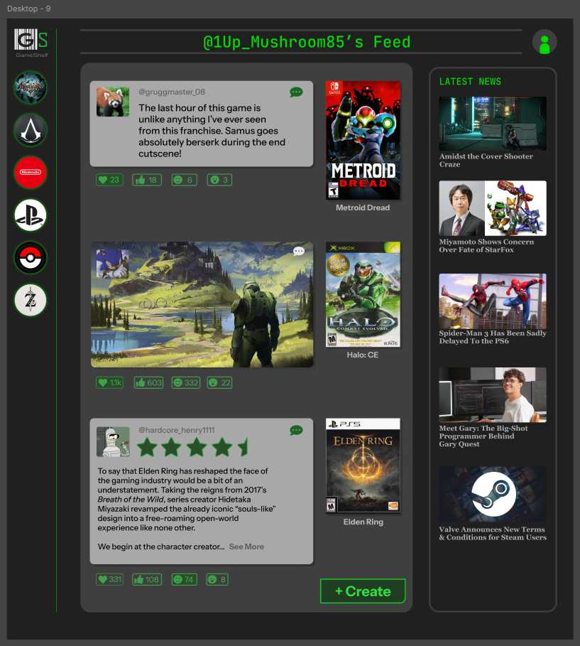
Revisions
Moved the comment button from the bottom-right of the post container to the top-right
Recolored comment icon to make it clearer that it's clickable
Shrank react icons to provide less clutter on the screen
Revised the headline font under "Latest News" to fit better with the overall typography
Changed page header as it was being confused with a search bar
Resized post windows to provide better alignment with the interface